Originally published at: New Logo for CoSocial - CoSocial Community Cooperative
Given that we are such a new organization, we are thrilled that we have a new logo!
We couldn’t have designed it without all of the feedback and insights from you our members! We asked you about which moodboard you wanted and then our fabulous designer Aline Monjardim designed our logo.
Here’s a post describing our process and timeline (you will need to be logged into our members portal). If you aren’t a member, it was a quick turnaround of a month and a bit for Aline to develop this.
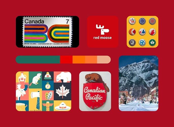
Moodboard 1: Patriotic, figurative, and classic. Built on Canadian nostalgia with a modern twist, this concept aims to rescue what unifies Canadians by celebrating its national symbols.
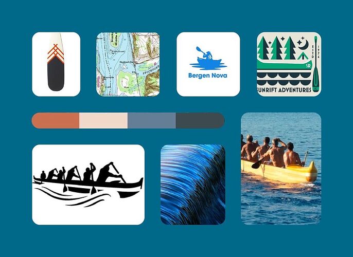
Moodboard 2:Democratic, representative, and new. Built on a sense of collaborative effort, this concept is a less obvious approach to connecting the people of Canada through collective movement.
And, the one you chose!
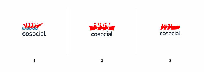
From there, we held another poll (we love polls!) that had these three as a a potential logo.
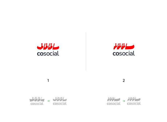
From that poll, Aline presented a final two revised logos.
Along with this, we asked Aline to respond to the comments. Here’s what she said, but in summary:
The summary of Aline’s comments is as follows:
- Aline has reviewed all the feedback and shared her expert opinion to help clarify design choices for the final logo. After testing the logo in various colours, Aline felt that red is the most effective, although future brand identity expansions may involve different colours. She advises using a single colour for easier identification and differentiation from competitors.
- Aline acknowledges the valuable insights on typography and details, noting there is some room for improvement. She has kept the elements that worked well in the original design.
- In regards to the Mastodon debate, Aline agrees with the views about creating movement and continuity in the design. The critique about one of the designs being unbalanced is addressed by explaining that it’s not unbalanced but simply not centered like another design. One design is classically vertically aligned, while the other uses tension and contrast for a modern, iconic look.
- Aline discusses the difference between a canoe and a rowing boat in one of the designs, influenced by the spacing and the canoe’s height. She mentions that an earlier double-sided canoe design was tested but found to be ineffective.
- Aline concurs that one design resembles an attack ship but clarifies it was inspired by indigenous canoes. To avoid misinterpretation, she has increased the contrast between the humans/paddles and the canoe for clarity.
- Lastly, Aline notes that adding the end of the canoe to another design resulted in it resembling a rowing boat, which she initially wanted to avoid. The shape of the canoe in this design was altered, but it still slightly resembles a rowing boat.
From this, we chose the final logo. Ultimately, the board made the final call, after some discussion with members.
We can’t end this without again thanking Aline, and here are her final words on the logo.
“Dear all,
I want to express my heartfelt gratitude to each and every one of you who contributed so wholeheartedly to this collaborative effort. It fills me with immense joy to announce the successful conclusion of this journey, culminating in the creation of an incredible final logo design for our non-profit just in time for the holidays. This achievement wouldn’t have been possible without the collective dedication and effort from all of you.
I am truly delighted by the abundance of valuable feedback shared through threads and emails. Your contributions have immensely enriched our community’s experience, making it both gratifying and efficient.
Once again, thank you all for your unwavering support and commitment throughout this process. I’m also happy to connect and to be considered for your next design/illustration project.
The logo design package has been sent out to @timbray who will be sharing it with the rest of y’all soon.
Merry Christmas,
Aline ![]()
![]()
![]() “
“
